
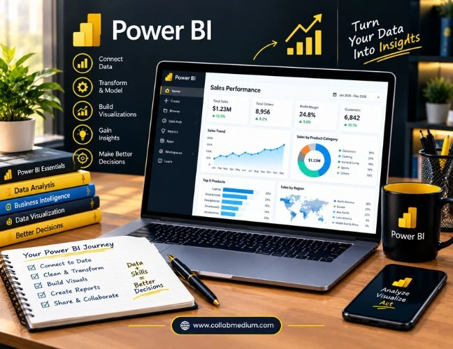
If you are wondering what Power BI is and whether it is worth your time, here is the direct answer. Power BI is Microsoft’s business analytics tool that turns raw numbers into clear reports and dashboards. I have used this platform across small teams and larger departments, and it consistently cuts reporting time in half. Companies rely on it for data analysis, financial management, and everyday business management decisions. Microsoft’s analytics tool now holds close to 45% of the global BI market, according to a 2026 IDC report. That scale matters. It means more templates, more community support, and faster answers when you get stuck. This guide walks through what the tool does, how to use it, whether it is free, and where it fits into real business workflows.
What Is Power BI?
Power BI is a business intelligence platform built by Microsoft. It connects to your data sources, whether that is Excel, SQL Server, or cloud apps like Salesforce, and turns that information into interactive charts. I remember the first time I connected it to a messy sales spreadsheet. Within twenty minutes, I had a dashboard showing trends nobody in the meeting had noticed before.
The software does not just display numbers. It lets you drill into any data point, filter by region or date, and share the finished report with your whole team. This tool ranks among the top business intelligence platforms worldwide, alongside Tableau and Qlik, and it now commands roughly 45% of that market according to IDC’s mid-2026 figures. That is a striking share for a single vendor in a crowded field.
What Is Microsoft Power BI Used For?
Microsoft Power BI covers three broad jobs: reporting, data analysis, and forecasting. Teams use it to track sales pipelines, monitor supply chains, and measure marketing return on investment. Executives lean on its dashboards during weekly reviews because the visuals update automatically as new data flows in.
More than 375,000 organizations worldwide, including over 75% of Fortune 500 companies, rely on this Microsoft product for these tasks, according to Mordor Intelligence’s 2026 industry report. That adoption number tells you something simple. When a tool works this well at this many companies, it is rarely a fluke. The platform also integrates directly with Microsoft 365, so reports can pull from Excel workbooks and Teams conversations without extra setup.
How to Use Power BI: A Simple Step by Step Approach
Learning how to use Power BI is easier than most people expect. I always tell beginners to start with these five steps.
- Download the Desktop app for free from Microsoft’s website.
- Connect to a data source, such as an Excel file or a database.
- Clean and shape the data using Power Query, the built in editor.
- Build visuals by dragging fields onto the report canvas.
- Publish the report to the online service to share it with colleagues.
Most new users can build a working report within a single afternoon. The learning curve gets steeper once you reach DAX formulas, but the drag and drop basics are genuinely approachable. Ever wonder why so many analysts recommend this path to beginners? It is because you see results before you have written a single formula. Practice on a small dataset first, then move to real company data once you feel comfortable navigating the interface.
Is Power BI Free?
Is Power BI free? Partly, yes. The Desktop app costs nothing and lets you build reports on your own computer. The catch is sharing. As soon as you want to publish a report to a team, you need a Pro license, which runs about $14 per user per month as of 2026, according to Microsoft’s official pricing page.
Premium Per User costs roughly $24 per month and unlocks larger datasets and more frequent refreshes. For solo learners and small side projects, the free desktop version alone can carry you a long way. For anyone budgeting a rollout, it helps to run the numbers the same way you would check an online calculator guide before committing to a bigger purchase.
| Plan | Monthly Cost | Best For |
| Desktop | Free | Individual report building |
| Pro | About $14/user | Team sharing and collaboration |
| Premium Per User | About $24/user | Large datasets, advanced AI features |
| Fabric Capacity | From about $263/month | Enterprise-wide deployment |
The table above should make budgeting easier before you commit to a paid tier.
Data Analysis Made Practical
Data analysis is where this platform earns its reputation. Analysts use it to spot patterns that spreadsheets hide, like a regional sales dip that only shows up once you slice the data by week instead of by month. Its AI visuals, including the Key Influencers chart, highlight which variables actually drive a trend rather than just showing correlation.
In my own reporting work, that single chart caught a supply issue two weeks before it showed up in our official numbers. That kind of early warning is the real value of data analysis done right. This tool also supports natural language queries, so you can type a plain English question and get a chart back instantly. That feature alone has saved my team hours during tight reporting weeks.
Business Management Gets Simpler
Business management teams use this tool to keep every department looking at the same numbers. Instead of five different spreadsheets circulating before a Monday meeting, one live dashboard shows sales, inventory, and staffing in the same view. That shared visibility reduces the back and forth that used to eat up entire mornings.
Managers can set alerts so the dashboard flags a metric the moment it crosses a threshold. That turns reactive management into proactive management. Retail chains, for instance, use these alerts to catch inventory shortages before shelves actually go empty. Smaller companies benefit just as much, since a single manager can now watch several store locations from one screen.
Financial Management That Finance Teams Trust
Financial management is one of the strongest use cases for this platform. Finance teams connect it to accounting software to track cash flow, budget variance, and profitability by product line. If your team already tracks core financial ratios, our return on assets formula guide pairs well with a dashboard built here, since you can automate the calculation instead of rebuilding it in a spreadsheet every quarter.
The built in DAX language calculates rolling averages and year over year growth automatically. Finance staff spend less time copying numbers and more time interpreting them. A 2026 Acuity Training report found that companies using Power BI for financial reporting save more than two hours per week per analyst simply through automation. That is real time given back to actual analysis instead of manual entry.
Common Mistakes to Avoid
Even experienced teams stumble on the same issues.
- Loading raw, uncleaned data straight into reports instead of shaping it first in Power Query.
- Building one giant dashboard instead of several focused ones.
- Ignoring row level security, which can expose sensitive financial data to the wrong viewers.
- Skipping refresh schedules, so dashboards quietly go stale within days.
- Assuming the free desktop tier will always be enough once a team starts sharing reports.
I have seen all five of these mistakes firsthand, usually in the first few months after a company adopts the tool. They are easy to avoid once you know to look for them. A short internal checklist before publishing a new report can catch most of these issues in minutes.
Pro Tips From Years of Building These Reports
A few habits separate strong users from frustrated ones. Name your measures clearly instead of leaving default labels like Sum of Column1. Use bookmarks to build guided walkthroughs for executives who do not want to click around on their own. Keep a single source of truth data model instead of duplicating tables across reports, since that alone prevents most of the confusing mismatched numbers I have had to debug.
Finally, schedule refreshes during off peak hours. A dashboard that updates overnight is far more reliable than one competing for bandwidth during the workday. Small habits like these add up to dashboards people actually trust and use every day.
Documentation matters more than most teams admit. I keep a short one page guide next to every dashboard I publish, explaining where each number comes from and how often it refreshes. New hires pick up the reporting workflow far faster when that context already exists. It also saves me from answering the same three questions every quarter when someone new joins the finance or operations team.
For the most current official numbers, check Microsoft’s Power BI pricing page before you finalize a licensing decision for your team.
Frequently Asked Questions
What is Power BI in simple terms?
Power BI is Microsoft’s data visualization and business intelligence tool. It turns spreadsheets and databases into interactive charts anyone on a team can explore.
Is Power BI free to use?
The Desktop app is free for building personal reports. Sharing reports with a team requires a paid Pro or Premium license.
How long does it take to learn Power BI?
Most beginners build a working report within a single afternoon. Mastering advanced DAX formulas typically takes a few months of regular practice.
What is Microsoft Power BI mainly used for?
It is mainly used for data analysis, financial reporting, and business management dashboards. Over 375,000 organizations rely on it worldwide.